


Growth Marketing
Three calls, three different weeks of my calendar, three brands that have nothing in common on paper. One does about $500K a month. One does $8M. One does $9M. Different categories, different teams, different ad channels. And on all three calls, I got asked some version of the exact same question: how do we make the website actually work harder for us? I've been doing this long enough that when three unrelated brands ask me the same thing in the same week, I stop and pay attention. So I want to walk through what I told all three of them, because the answer surprised at least two of them.
Here's the part that always throws people off. All three of these pages were, by any normal checklist, good. Clean product photos. Detailed FAQs. Reviews. Shipping info. Every box you'd expect on a product detail page was checked. And the pages still read like inventory. That's the trap I keep running into with brands at every revenue size: a technically complete page with no point of view is just a well-organized shelf. Nobody buys off a shelf. They buy from someone who understood what they needed.
A Complete Page Isn't the Same Thing as a Persuasive One
Every one of those three pages had product photos, features, an FAQ section, shipping details, and a reviews widget. Every box checked. And every single one still converted like it was talking to nobody in particular. That's the pattern I want you to actually sit with, because it's the single most common reason a "good" page underperforms. Most teams treat the product page like a checklist instead of an argument. They ask "do we have reviews," not "what is each review actually proving." They ask "do we have an FAQ," not "does this FAQ remove the one objection that's actually stopping this specific customer."
A page needs an unapologetic point of view. I call this the angle. It's a wide-tent idea that tells the shopper how to see the product, how to interpret it, and where it fits into their actual life. Not a tagline. Not a feature list. A lens. Once you pick that lens, everything else on the page inherits a job: the copy, the photography, the education section, and especially the proof.
🎯
The Real Test
Stop asking "does my page have social proof." Start asking "what is each piece of proof actually proving, and why does this specific customer need to see it." If you can't answer that for a review, a logo, or a creator clip sitting on your page right now, it's probably just decoration.
The Angle Gives Every Piece of Proof a Job
A logo, a review, or a creator video is not automatically persuasive on its own. It only does work when it reinforces the page's point of view. This is where I see the most money left on the table, because most brands collect proof and then scatter it around without asking what it's supposed to be proving.
Take electrolytes. If the angle is morning clarity, a review that says "these cleared my morning brain fog" is doing real work, it directly reinforces the promise. A review that says "these taste so good" is pleasant and completely wasted. It's true, it's positive, and it does nothing for the shopper trying to decide if this product solves their specific problem.
Same logic applies to durability. If your angle is that the product lasts, a photo of it still holding up after five years of daily use beats another generic five-star badge every time. And if the page is built for side sleepers dealing with shoulder pain, the strongest proof on that page had better be talking about shoulder pain specifically, not just general comfort.
| The Angle | Weak Proof (True, But Wasted) | Strong Proof (Reinforces the Angle) |
|---|---|---|
| Morning clarity | "These taste so good." | "These cleared my morning brain fog within a week." |
| Built to last | "5 stars, would buy again." | A photo of the product still performing after five years of daily use. |
| Built for shoulder pain / side sleepers | "Super comfortable pillow." | "First pillow that didn't leave my shoulder aching after a full night." |
| Effortlessly close shave | "The blades are incredibly strong." | "The blades are so strong I get a close shave, but I don't get razor burn anymore." |
Notice the pattern in that right-hand column. Every strong example names an outcome, handles an objection, or captures a moment of relief. The weak examples are all pleasant and all forgettable. Ask the questions in your review requests that actually pull out the before-and-after, and put the numbers where they matter. "4.8 stars from 12,000 customers" is a real signal. "4.8 stars" by itself is decoration.
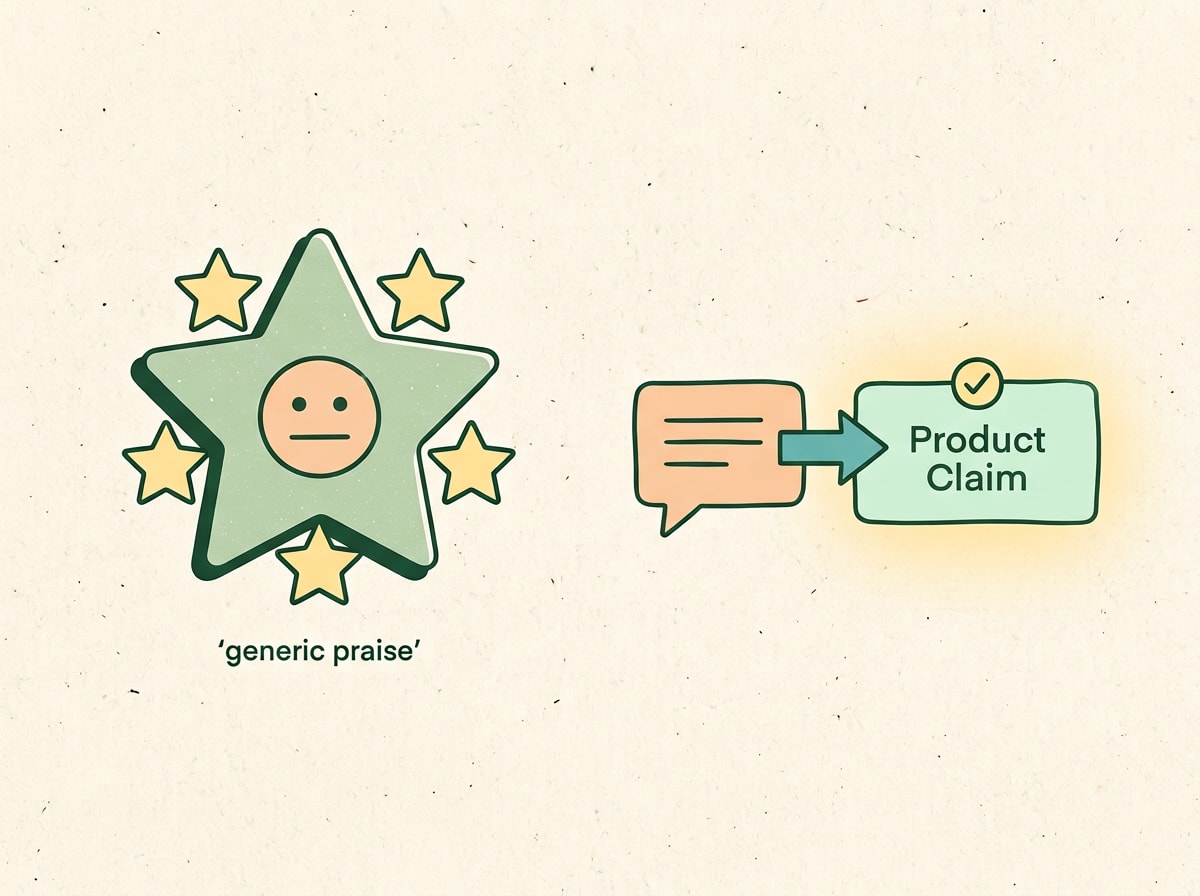
Generic praise floats on its own. Proof only earns its keep when it connects straight back to the claim.
Why Social Proof Has to Be a Layer, Not a Section
Here's a mental model I use with every client on this exact problem. Think about the friend who always tells you things you didn't ask for, and you're never quite sure if they're telling the truth. That's how a brand-new visitor sees your brand the first time they land on your page. You are asking a complete stranger to pull out their credit card. Social proof is how you earn that, and it doesn't happen in one widget at the bottom of the page. It happens above the fold, in the middle, and at the bottom, in that order.
Most teams bury a reviews carousel at the very bottom of the page and consider the job done. That's treating proof like a checkbox again, the same mistake as before, just moved one level down. If you want the deeper mechanics of why that specific placement mistake tanks conversion on marketplaces too, we broke down the pattern in more detail in our piece on five Amazon PDP mistakes that are quietly destroying ROAS. The placement logic carries over almost exactly, whether you're on your own site or someone else's marketplace.
The Proof Stack: Eight Layers, Each With a Different Job
These aren't isolated widgets. Treat them as a system, not a pile.
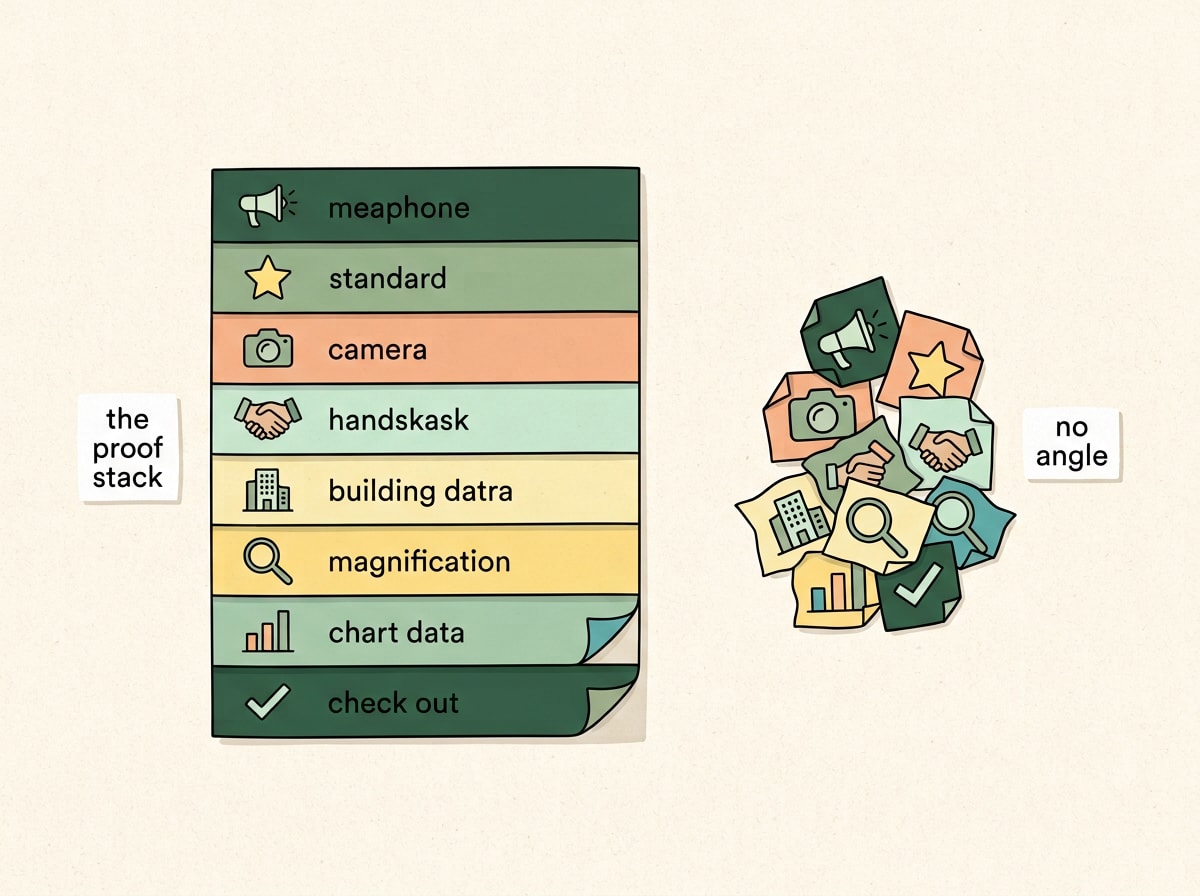
Eight layers, stacked with intention, build a page. The same eight elements dumped without one just build a pile.
1. The Brag Bar
A strip right below the hero that quietly says thousands of real people already trust this, so should you. Use publisher logos your specific customer actually recognizes, not the ones that flatter the founder. An older audience trusts a name like The New York Times. A younger audience responds more to something like PopSugar. Then pull the one sentence from that press mention that actually lands the punchline. Recognition earns the initial glance. Specificity is what sells.
2. Reviews With an Angle
Most review carousels are wallpaper. The reviews that actually sell carry an outcome, an objection handled, or a moment of relief, not just enthusiasm. Ask review-request questions designed to pull out the before-and-after story, not just a star rating.
💡 Did You Know
Shoppers who engage with photo or video reviews on a product page convert at roughly 5.9%, compared to about 2.8% for visitors who only see text-based reviews, a difference of more than 106%, according to research summarized by Skeepers. A browsable, photo-driven review widget is genuinely one of the highest-leverage single changes you can make to a PDP.
3. Real Customer Photos and Videos
A genuinely real customer using the product lands completely differently than a polished, commissioned piece of UGC. It should feel discovered, not manufactured. Eight Sleep's Wall of Love is the reference example everyone in ecommerce points to. Jolie takes it even further, screenshotting real iMessage conversations from customers and putting them directly on the page with minimal editing. It reads like documentary evidence, not marketing copy, and that's exactly why it works.
4. Creator Proof That Carries Through the Whole Funnel
Creators hand you proof, language, and a live demo all at once, which is genuinely valuable. The mistake I see constantly is treating a creator partnership like an ad that ends the moment someone clicks. If a creator wins by talking specifically about shoulder pain, the landing page they click through to had better keep talking about shoulder pain. Don't just run their clip as an ad. Build the entire funnel behind it, since the whole point of that creator's credibility gets wasted the second the page underneath stops matching what convinced the viewer in the first place. If you're rethinking how your media spend and landing experience need to work together right now, our breakdown of eight Meta ads lessons from someone who's managed over $300M in spend covers a lot of the same disconnect from the paid media side.
5. Partnerships and Collaborations
A strong collaboration is a co-sign. You're borrowing a bigger partner's aura for a moment. But swapping in a random logo isn't proof of anything by itself. The partnership has to help the shopper understand who the product is actually for, and then it needs to get turned into real photography, real quotes, and on-site proof that keeps working for months after the announcement post is old news.
6. Out-of-Home and Cultural Presence
Shoppers associate a billboard with a real, established company, so the media buy itself functions as a signal of scale. But the real unlock most brands miss is bringing that presence back onto the site. Photograph the installation. Capture people's reactions. Document the actual moment it happened. The point was never "we bought a billboard." The point is "this brand exists out in the real world, not just in your feed."
7. Traction Proof
Concrete business facts do more persuasive work than most brands give them credit for. Units sold. Years in business. Retail doors. If a family business has quietly run for forty years and sold a million units, that fact belongs near the top of the page, not buried in an About Us page nobody visits. If you're sitting in twelve thousand retail stores, that single fact carries more weight than another clever headline ever will.
8. Demonstration and Named Authority
Show the actual evidence. Side-by-side comparisons, before-and-afters, cost-per-use math, a named expert willing to put their credibility behind the claim. One cognitive performance brand puts a firefighter, a special forces officer, and an NFL player at the very top of the page, then switches to everyday customer reviews further down. The order matters as much as the proof itself. And kill vague language like "trusted by thousands" wherever you find it. A specific claim like "81% noticed less shedding" will always outperform a generic phrase like "clinically proven."
380%higher conversion lift from reviews on higher-priced items, per a Northwestern University study run with PowerReviews
68%higher conversion for products with 11 to 30 reviews versus zero reviews, per PowerReviews research
106%conversion lift from photo and video reviews over text-only reviews, per Skeepers
Sources: PowerReviews and Northwestern University's Spiegel Digital & Database Research Center; Skeepers.
Don't Just Dump All Eight Layers on the Page
The strongest pages don't use all eight layers at full volume. They pick the proof that actually supports their specific angle and let the rest go. Before adding any piece of proof to a page, I run it through the same quick filter every time.
- Is it relevant? Does this specific piece of proof connect to the angle you picked, or is it just generically positive?
- Does the customer recognize it? A publisher logo or partner name only works if your specific audience actually knows and trusts it.
- Does it name an outcome? "Tastes great" names nothing. "Cleared my brain fog in a week" names something real.
- Does it feel earned? Polished and commissioned reads as marketing. Slightly rough and specific reads as true.
- Is it sitting next to the claim it supports? Proof that's disconnected from the claim it's meant to back up does almost nothing, no matter how strong it is on its own.
Different customers need different proof, and this is where a lot of pages quietly fail even when every individual element is good. The skeptical shopper needs the expert quote and the named authority. The impulsive buyer responds to the star count and the sheer volume of reviews. The empathetic buyer needs a review from someone who sounds like them, describing a situation they recognize. Social proof shouldn't sit next to the claim as decoration. It should finish the claim.
You're not decorating a claim with proof. You're finishing a sentence the shopper started reading the moment they landed on the page.
Where This Actually Shows Up Beyond the PDP
Everything here applies just as much off the product page as on it. The angle-plus-proof framework is exactly why some landing pages quietly outperform an entire ad account's worth of traffic while everything around them plateaus. We go much deeper into which landing page structures are actually driving that kind of performance in our piece on the six landing pages quietly printing money on Google and Meta right now, and the pattern underneath every single one of them is the same thing we've been talking about here: a clear point of view, with proof doing a specific job at every stage of the page.
This isn't just something I've noticed anecdotally with clients either. A WebFX study of nearly 600,000 AI referral sessions found product pages capture the second-largest share of all AI traffic, right behind homepages, and the pages that performed best were the ones with the most specific, complete answers, not the most generic ones. I go deeper into what that study found in this breakdown of what 600,000 AI sessions reveal about the content that actually wins.
What I Actually Told Those Three Brands
All three of those calls ended in roughly the same place. None of them needed more traffic. None of them needed a redesign from scratch. They needed to pick an angle and then go back through every single piece of proof already sitting on their page and ask what job it was doing. In most cases, half of it wasn't doing anything at all. It was just there because someone once said the page needed social proof, without anyone asking what that proof was actually supposed to prove.
💬
Where I Land On This
In this era of media buying, where traffic arrives from a dozen different channels with a dozen different expectations already baked in, every page and every step of the customer's journey needs to hit people with a clear angle and proof that backs it up. That's genuinely the fastest way to get someone who's never heard of you to actually care enough to look closer at why what you're selling is any good.
If you're staring at a page with every box checked and conversion that still won't move, that's usually the tell. The page isn't missing proof. It's missing a point of view for that proof to work for.
