


Growth Marketing
Most brands are still spending their entire ad budget sending strangers straight to a product page that was written to sell, not to explain. That's the whole problem, and it's costing a lot more than people realize.
I spend a fair amount of my week going through Facebook ad libraries, watching what's actually running right now versus what marketers claim is working on LinkedIn. And the pattern that keeps showing up, over and over, across supplements, beverages, apparel, and beauty, is this: the brands with the best paid social numbers are almost never sending cold traffic to their product page anymore. They're sending it to a listicle.
If you haven't heard that word thrown around, a listicle in this context is a "5 reasons why" or "7 things nobody tells you about" style page that sits between the ad and the product page. It reads like an article. It doesn't look like a sales page. And it converts a lot better than the page you probably spent the most money designing.
I want to walk through why this format works, what separates a listicle that actually converts from one that just looks like a listicle, and how to build one without falling into the trap that's killing most of the ones I see, which is that they're clearly written by AI and it shows.
📊 Did you know?
The average ecommerce landing page converts somewhere between 2% and 4%, while paid social traffic specifically converts at closer to 12% when the page actually matches the ad. That gap is almost entirely a function of relevance, not budget. Source: SeedProd, 2026
The problem with sending traffic straight to a product page
Here's the thing about a product page. It has one job, and that job is to close. It talks about ingredients, or fabric, or specs, or price. It's written the way you'd talk if you already knew the person wanted to buy. But somebody who just saw your ad for the first time doesn't know that yet. They're not ready to be closed. They're ready to be convinced.
Think about the earplug example. A product page for a pair of earplugs is going to talk about noise cancellation, decibel reduction, materials. That's fine copy, but it only speaks to people who already know they want earplugs and are comparing specs. A page titled "7 Reasons Nobody Warns You About Before Your Next Concert" speaks to a much bigger audience, because it's not selling a product category, it's speaking to an experience people already relate to. It casts a wider net and it qualifies that traffic in a way a spec sheet never will.
That's the actual mechanism behind why listicles convert. They're not tricking anyone. They're just meeting cold traffic where cold traffic actually is, which is somewhere between "I saw an ad" and "I trust this enough to buy."
| Page type | Typical conversion rate | What it's built to do |
|---|---|---|
| Homepage / collection page | 1–3% | Browse and compare |
| Standard product page | 2–4% | Close a decision already made |
| Optimized landing page | 6.6% median, up to 10%+ for top performers | Match the ad message to a specific offer |
| Paid social traffic on a matched page | ~12% average | Convert cold, unaware traffic |
Sources: SeedProd, involve.me
Brands running well-built listicles that go through a real strategy and testing process are regularly seeing that number climb from a sub 2% product page baseline to somewhere in the 6 to 7% range once the traffic gets qualified through a story first. That's not a small tweak. That's a page that changes your entire paid social math, because your cost per acquisition drops without you having to spend a dollar more on media.
How the actual winners build these pages
The format looks simple from the outside. Headline, a few reasons, a button, done. But the pages that actually perform go through a specific process before a single line of copy gets written, and skipping that process is exactly why most listicles I see feel hollow.
1. Research
→
2. Copy & notes
→
3. UX wireframe
→
4. UI design
→
5. Final copy
→
6. Launch & test
1. Research comes first, and it's the step most people skip or outsource entirely to AI
This is where I'll push back on how most teams use AI right now. If you open ChatGPT or Claude and just ask it to "research reasons people buy multivitamins," you're going to get the same generic bullet points every other brand selling a multivitamin is also getting. It's not wrong information, it's just not differentiated information, and differentiation is the entire point of this exercise.
The better approach is to actually go do the digging yourself first. Spend an hour or two in Reddit threads, niche forums, TikTok comment sections, and small blogger sites talking about the problem your product solves, not the product category itself. Keep research on one side of a doc and jot down anything that surprises you, anything you'd personally find convincing, on the other side. You're building a raw material file, not a final draft. If you do want AI involved at this stage, use it to help you write a sharper prompt first, then feed that prompt back in. It changes the quality of what comes back by an order of magnitude.
By the time this phase is done, you should have several pages of genuinely interesting findings, specific enough that they couldn't have come from a generic AI search. That's your raw material for everything downstream.
2. Wireframe mobile first, every time
✅ Why this matters
Mobile makes up somewhere between 75% and 80% of ecommerce browsing traffic globally, and holiday peaks have already pushed past 60% of actual purchases on mobile in the US. If you design for desktop and shrink it down, you're optimizing for the minority of your traffic. Source: Capital One Shopping Research, 2026
Designing desktop first and squeezing it into a mobile frame is one of the most common and most avoidable mistakes in this entire process. When a full desktop hero gets compressed down to a phone screen, the elements that get pushed below the fold are almost always the ones doing the heaviest lifting: social proof, guarantees, and the actual reason to buy. Start with the phone. Get the above-the-fold section tight and complete on a 6 inch screen, then use the extra real estate on desktop to add, not to rearrange.
3. Load up on social proof, then load up some more
This is the part where I see the biggest gap between amateur listicles and the ones running at real scale. The high performers don't sprinkle in a couple of testimonials. They stack reviews, star ratings, customer counts, "as seen in" badges, and doctor or expert endorsements throughout the entire page, not just at the bottom.
270%
more likely to be purchased with 5+ reviews vs. zero
3.5x
higher conversion for products with reviews vs. none
166%
conversion lift from displaying user-generated content
Sources: ConvertX, PowerReviews via EasyApps, WiserNotify
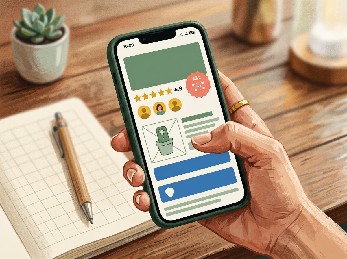
There's also a detail worth knowing here, from the Spiegel Research Center: the conversion impact of reviews is roughly 380% higher on higher priced items than lower priced ones. That's the opposite of what most people assume. The more expensive the decision, the more social proof you need to stack, because the buyer's uncertainty scales right along with the price tag.
One more thing worth flagging: a page full of perfect five star reviews can actually work against you. Shoppers have gotten savvy enough to distrust an all-5.0 rating. A 4.6 to 4.8 average with a real spread of ratings reads as more honest, and honest reads as more trustworthy.
4. Use urgency that's actually true
Sellout risk messaging works. Countdown clocks, low stock counters, "ships today" indicators, all of it pushes people over the finish line by tapping into real loss aversion. But there's a growing legal problem brands are running into here, and it's worth a paragraph of its own: several DTC brands have already faced class action complaints for running "sales" that were actually just their always-on price, dressed up to look like a limited time discount. If your urgency messaging isn't tied to something real, whether that's actual inventory, a genuine seasonal promotion, or a real production timeline, you're not just risking a bad review, you're risking a legal problem. Use urgency. Just make sure it's true.
What happens after someone clicks through
A great listicle that dumps traffic onto a mediocre product page is still a wasted opportunity. The listicle's job is to qualify and warm someone up. The product page's job is to close using everything the listicle just built. That means your product page also needs a real image carousel at the top (think of it as a scrollable highlight reel of the entire page, since heat map data consistently shows this is the most interacted-with section on any PDP), bundling options with a clear savings breakdown, and social proof that doesn't stop once the listicle ends.
Bundling in particular deserves more attention than most brands give it. A one month, three month, and five month subscription option with an increasing discount at each tier does two things at once: it raises average order value, and it commits a customer to a longer relationship with the brand before they've even made their first purchase.
💡 A related read
If you're building out subscription tiers for the first time, we've gone deeper on structuring discount ladders and retention offers in our breakdown of subscription pricing models for DTC brands.
Don't stop the personalization at the landing page
Everything above is about the first click. But the brands getting the best lifetime value out of this entire funnel are extending the same "meet the customer where they are" logic into what happens after the sale, especially in email and retention.
The mistake I see constantly is brands cross-selling by category instead of by occasion. Someone buys your barbecue rub in May, and the follow-up email is "check out our other rub." That's lazy, and it's leaving revenue on the table. The better play is recognizing that someone buying a rub in grilling season is probably planning a specific moment, so the follow-up should be a grilling bundle: the rub, the sauce, the marinade, maybe a recipe card. You're selling an experience tied to something they're already doing, not just asking them to buy more of the same SKU.

📈 The data behind it
McKinsey's research on personalization found it can lift revenue by 5 to 15%, improve marketing ROI by 10 to 30%, and cut customer acquisition costs by as much as 50% when it's done well. Companies growing the fastest derive roughly 40% more of their total revenue from personalization than their slower-growing peers. Source: McKinsey & Company
The same "two layers deep" thinking that makes a listicle headline work (speaking to an occasion or identity, not just a product category) is exactly what should be driving your post-purchase email flows. Holiday entertaining, game day, weeknight dinners, back-to-school, whatever fits your product. Build the flow around the moment, not the SKU.
We've written more specifically about structuring retention flows by customer behavior rather than by generic time-based triggers in our piece on behavior-based email sequencing, and if you're still deciding whether to build this in-house or lean on a platform, our comparison of build versus buy for retention tech covers the tradeoffs in more detail.
The AI trap that's making every listicle look the same
I want to come back to something I mentioned earlier, because it's the single biggest reason most listicles underperform right now. Everyone has access to the same AI tools, which means everyone's research phase is starting to look identical, and it shows up in the final page. If your research came from asking a general AI assistant to "find reasons people buy X," your competitor selling a nearly identical product probably asked the exact same question and got a nearly identical answer.
The brands pulling ahead right now are using AI heavily in the parts of the process where it's genuinely strong, drafting copy variations, briefing out a wireframe, coding a build, generating on-brand imagery, while keeping actual humans in the research and strategy seat. That's not a nostalgic preference for "the old way." It's a practical read on where the differentiation still lives. Anyone can generate a page that looks fine. Not everyone can find the specific insight, from a forum thread or a TikTok comment section, that makes a stranger stop scrolling and actually read reason number three.
✅ A quick self-check before you launch
- Does the headline speak to an occasion or identity, not just the product category?
- Was this wireframed mobile first, not squeezed down from desktop?
- Is social proof present in more than one section of the page?
- Is every urgency claim on the page actually true?
- Does the product page it links to continue the story instead of resetting it?
- Would a genuinely skeptical customer find at least one detail here that surprised them?
What this means for how you spend your next media dollar
If you're running paid social right now and sending cold traffic straight to a product page or collection page, you're likely leaving a meaningful amount of performance on the table before the media even has a chance to work. The fix isn't complicated, but it does require slowing down at the front end. Do real research instead of outsourcing it entirely to a generic prompt. Build mobile first. Stack your social proof deeper than feels comfortable. Make your urgency real. And carry the same thinking about occasion and identity into your retention flows once someone actually buys.
None of this is a secret formula. It's closer to discipline. The format has been sitting in plain sight since the early days of BuzzFeed and Refinery29 built entire media businesses on the exact same psychological hook: people like being told a story that ends in an answer they were looking for anyway. DTC brands are just now catching up to what publishers figured out over a decade ago, and the ones applying it with real strategy behind it are the ones pulling meaningfully ahead on paid social right now.
